“The idea was a simple one – reinvigorating a post- war house and maximising the natural attributes of a wonderful, leafy site.” So says Shaun Lockyer, director at Shaun Lockyer Architects (SLa). Although the post-war Bardon home was standing strong, it wasn’t quite what this young family required – meaning a revamp that would see it emerge squarely aside its modern compatriots.
 Since commencing in 2009, SLa has been focusing on creating memorable, sustainable and efficient homes; Shaun himself has over 20 years of international design experience, including nine years at the helm of Brisbane’s iconic Arkhefield and four at South Africa’s internationally-renowned SAOTA. In addition to this, he has personal experience in renovating historical homes. His own post-war home renovation, completed a few years prior, was certainly a source of inspiration for this undertaking. “It showed me the potential of retention and reinvigoration, rather than removal and rebuild,” he explains.
 And so, this home wasn’t knocked to the ground and built anew. Its history inspired its redesign, creating a family home for Travis and Josie, their son Dash, and their smattering of dogs.
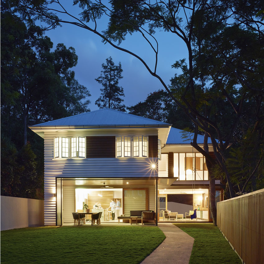
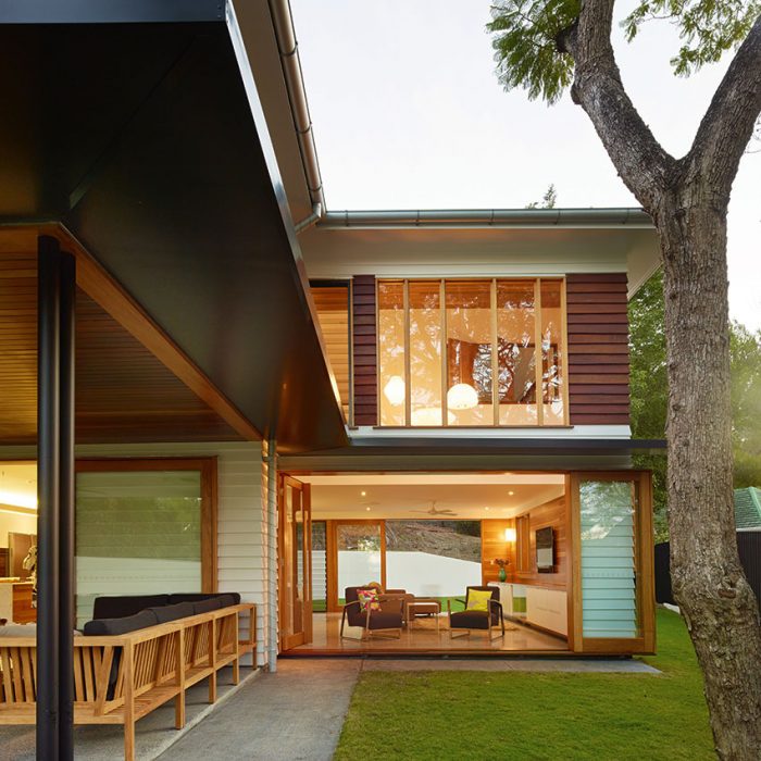
 The home’s considerable expansions were completed by Cullum Hughes of CGH Constructions (“He was unreal,” says Shaun), creating a home that really hasn’t lost any of its original flavour. As Shaun says, it’s almost exactly as it was. “We tried to keep the base all in glass to retain the form of the original house,” he says. “We didn’t want to undermine what was there.” The original home now sits atop wide open extensions, with white panelling creating a crisp, modern look. A dark timber band adds interest to the rosewood windows and doors, while below, a sun-flooded entry sequence forms a “gloriously bright and textural space”.
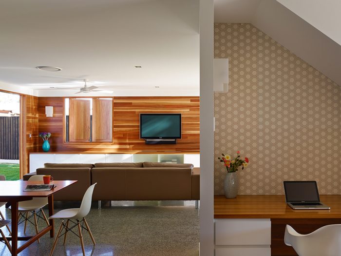
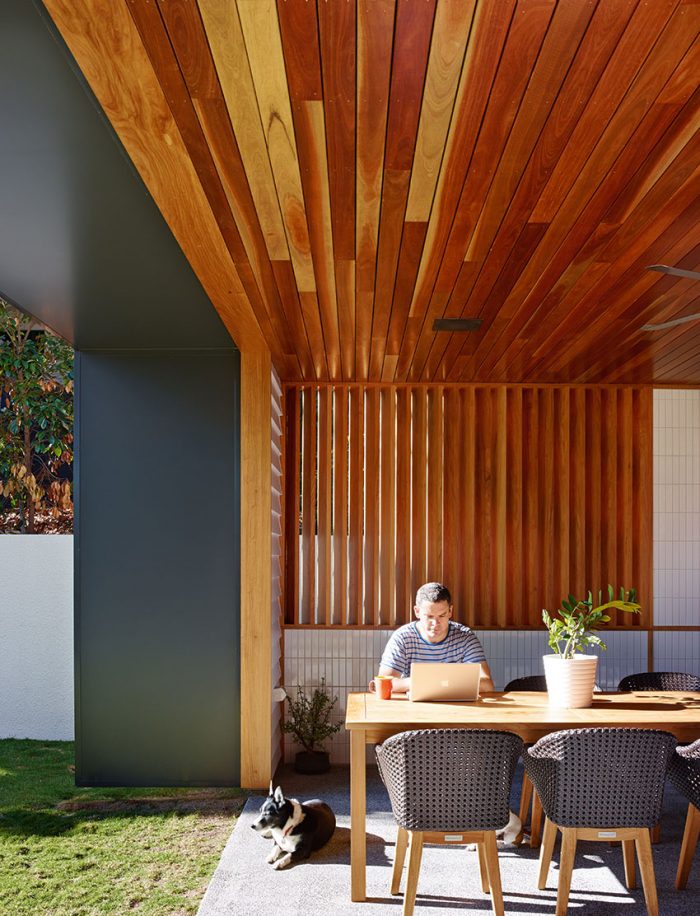
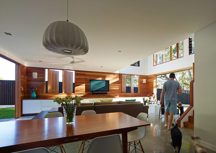
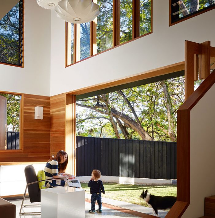 Indoors, there’s plenty of space for the family, with added hints of elegance to cater to the adults in the mix – a powder room, complementing four bedrooms and two bathrooms, is a modern must-have. However, the team embraced the design ethos of ‘less is more’, using simply crafted materials offset by well-executed design. “We stuck to basics,” explains Shaun. “Timber, stone and concrete – that’s what this project was all about.” Spotted gum graces everything from the decking to the cabinetry, while polished concrete with grey cement and black aggregate adds a classic touch. It’s a blank canvas for changing interior design choices as the years go on.
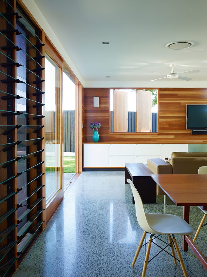
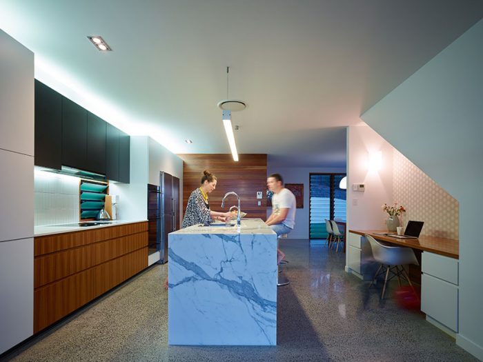
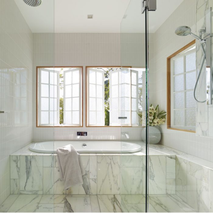
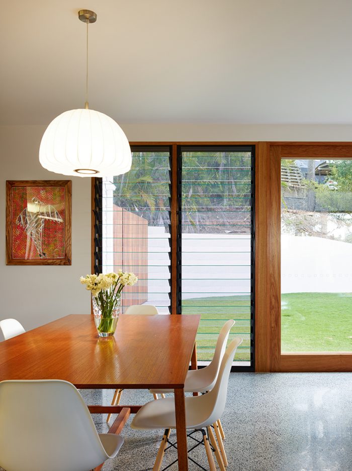 Although Calacatta and Pietro Grey marble were used as high-end embellishments, the modernist philosophy grounding the home is truly evident. “What inspired the colour scheme in the home? “Honesty and simplicity,” he says. “We were true to the materials, making them shine yet still be timeless.” From light fittings to wallpapers, flooring to ceilings, the home enjoys an utterly natural feel. “It’s the modernist in me coming out,” laughs Shaun. “The houses feel more timeless this way. We want our work to endure.”
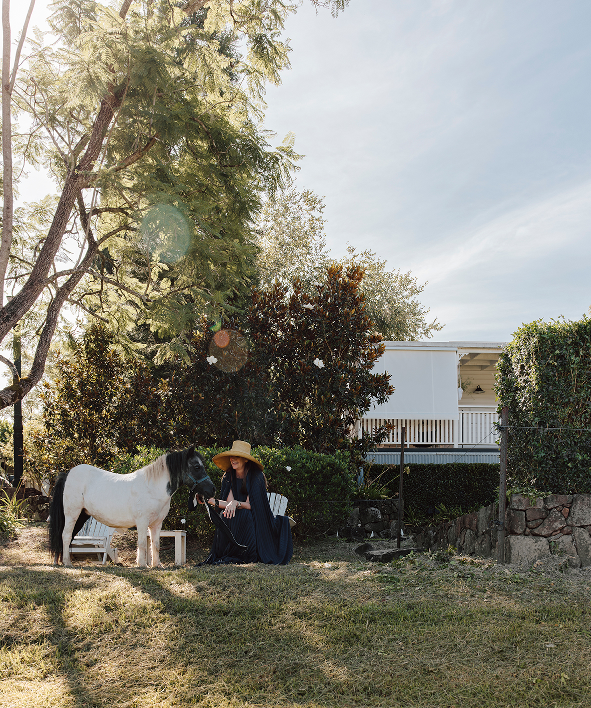
 And it certainly does, tucking neatly into this historical suburb with ease. Leafy parks and spacious homes are in abundance, with a peaceful, old-world vibe attracting plenty of young families. Like many post-war houses, the home is situated on a larger than average block; the redesign was to utilise as much land as possible. Of course, this was easier said than
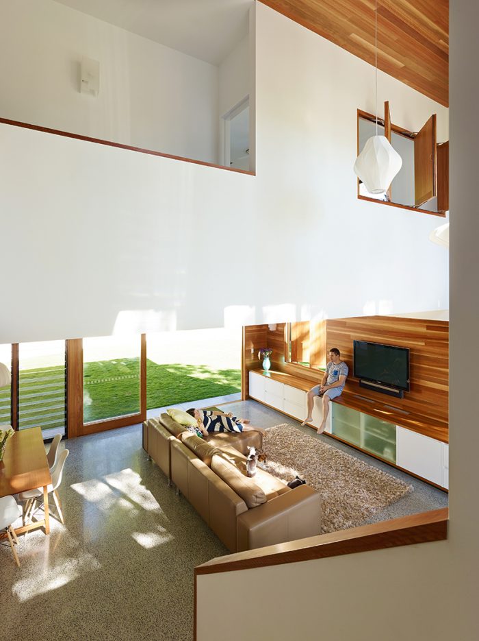 The 1174sqm block may look flat now, but don’t be fooled. “The site was irregular in plan and twisted in sections – anything but flat in reality!” he says. “It was the most costly exercise, but the most valuable, too.”
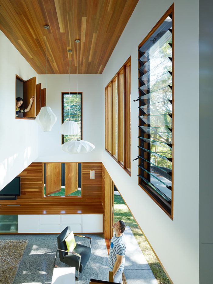 So how does a post-war renovation succeed like this? It’s all about knowing when to quit, says Shaun, and knowing the amount of time and effort that will go into creating a home that straddles the divide of new and old. “Do less, but do it well,” he advises. “It’s so hard to stop halfway when you know the potential of going the extra mile.” Planning the project meticulously also comes into play (six months of planning and design work for this renovation, compared to ten months of building), to ensure the end result is timeless and reflective of the huge amount of work that goes into it. And our favourite piece of advice? “Simplicity can be enjoyed through simple moves, beautifully executed.”
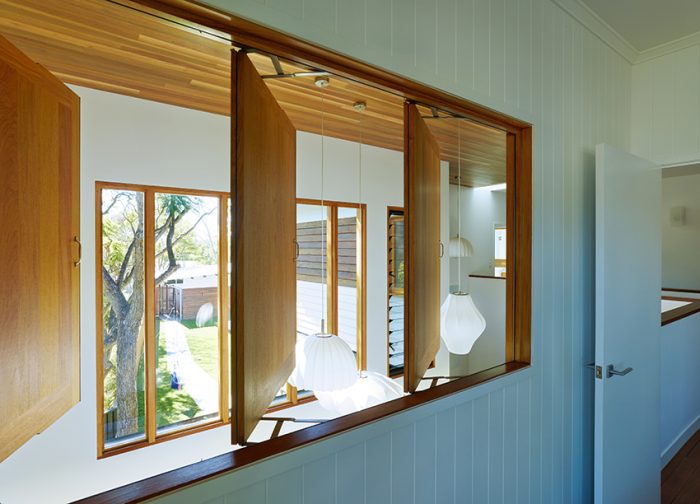
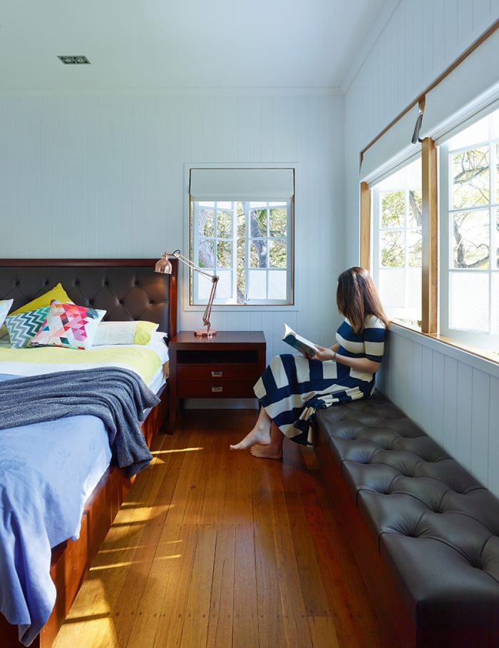
The SLa trademark is homes that aren’t affected by trends, and a cursory glance at the Bardon home sees that it, too, follows this ethos while staying true to its historical roots. “It’s important to acknowledge our history, even if at times it seems uninspired,” says Shaun. “We’ve retained the architectural form in a contemporary way, continuing this home’s history and spirit in a refreshed and relevant style – which is why we call it a ‘post post-war’ home.”
Words by Natasha Pavez. Photography by Scott Burrows.
Follow Queensland Homes on Twitter, Facebook, Google+ and Pinterest. If you haven’t grabbed a copy yet you can get the digital edition now or the print copy (free postage in Australia).
